Visualizing Graphs with Plotly Python
In this post, I will show working examples of the Plotly Python library.
Why Plotly Python?
Plotly Python is a free, open-source graphing library for Python. I think it is more powerful than Matplotlib for the following reasons.
- Fully integrated with JupyterLab.
- Interactive interface: useful for large graphs and 3D visualization.
- Simple and rich APIs.
Note: Matplotlib is still useful for simple, on-the-fly graphing and repetitive tasks, such as generating a number of images.
Installation
In addition to Plotly Python, I am using NetworkX and JupyterLab for visualizing graphs. Those tools can be installed by pip.
$ pip install networkx jupyterlab plotly
Then, install the following JupyterLab extensions. See JupyterLab Support.
$ jupyter labextension install jupyterlab-plotly
Versions used for this post:
$ python --version
Python 3.8.5
$ pip list |egrep 'networkx|jupyterlab|plotly'
jupyterlab               3.0.6
jupyterlab-pygments      0.1.1
jupyterlab-server        2.1.3
networkx                 2.5
plotly                   4.14.3
Visualizing 2D Graphs
First, create a new Jupyter Notebook.
- Launch JupyterLab:
jupyter-lab - Create a new Jupyter Notebook with Python 3.
With Plotly, we represent nodes as scattered markers and edges as a set of line graphs with gaps. To facilitate this process, I have written a thin wrapper class specialized in NetworkX graphs.
Download and run this file in a Jupyter Notebook cell.
%run visualize.py
Next, I want to visualize the Petersen graph. To get better visualization, I manually set the position of each vertex. Refer to NetworkX’s document if you want an automatic layout.
G = nx.petersen_graph()

# set 2D positions
import math

pos2d = {}

for i in range(5):
    theta = 2 * math.pi * i / 5 + math.pi / 2
    pos2d[i] = (2 * math.cos(theta), 2 * math.sin(theta))  # outer vertices
    pos2d[5 + i] = (math.cos(theta), math.sin(theta))      # inner vertices

for v in G:
    print('%d: (%6s, %6s)' % (v, '%.3f' % pos2d[v][0], '%.3f' % pos2d[v][1]))
Output:
0: ( 0.000,  2.000)
1: (-1.902,  0.618)
2: (-1.176, -1.618)
3: ( 1.176, -1.618)
4: ( 1.902,  0.618)
5: ( 0.000,  1.000)
6: (-0.951,  0.309)
7: (-0.588, -0.809)
8: ( 0.588, -0.809)
9: ( 0.951,  0.309)
Then, create an instance of the GraphVisualization class defined in visualize.py with the 2D positions.
vis = GraphVisualization(G, pos2d)
fig = vis.create_figure()
fig.show()
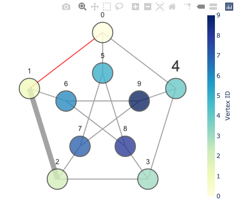
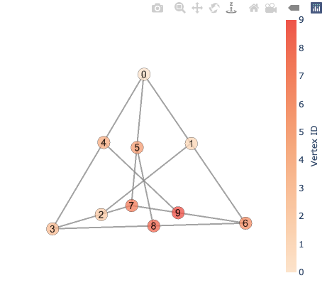
With the GraphVisualization class, one can specify various options, such as vertex color and edge width.
vis = GraphVisualization(
    G,
    pos2d,
    node_text_position='top center',
    node_size=40,
    node_color=int,                   # color vertices based on their IDs
    node_text_font_size={4: 30},
    edge_color={(0, 1): '#ff0000'},
    edge_width={(1, 2): 10}
)
fig = vis.create_figure(showscale=True, colorbar_title='Vertex ID')
fig.show()
Visualizing 3D Graphs
Visualizing graphs in 3D is easy with Plotly. What we need is just to describe a position as a tuple of three numbers. The following code gives 3D positions for the same Petersen graph, using a realization on a tetrahedron.
# set 3D positions

r = math.sqrt(3)
def mid(a, b):
    return tuple((a[i] + b[i]) / 2 for i in range(3))

pos3d = {
    0: (0, 0, r),
    3: (1, 1/r, 0),
    6: (-1, 1/r, 0),
    7: (0, -2/r, 0),
}
pos3d[1] = mid(pos3d[0], pos3d[6])
pos3d[2] = mid(pos3d[3], pos3d[7])
pos3d[4] = mid(pos3d[0], pos3d[3])
pos3d[5] = mid(pos3d[0], pos3d[7])
pos3d[8] = mid(pos3d[3], pos3d[6])
pos3d[9] = mid(pos3d[6], pos3d[7])

for v in G:
    print('%d: (%6s, %6s, %6s)' % (v, '%.3f' % pos3d[v][0], '%.3f' % pos3d[v][1], '%.3f' % pos3d[v][2]))
Output:
0: ( 0.000,  0.000,  1.732)
1: (-0.500,  0.289,  0.866)
2: ( 0.500, -0.289,  0.000)
3: ( 1.000,  0.577,  0.000)
4: ( 0.500,  0.289,  0.866)
5: ( 0.000, -0.577,  0.866)
6: (-1.000,  0.577,  0.000)
7: ( 0.000, -1.155,  0.000)
8: ( 0.000,  0.577,  0.000)
9: (-0.500, -0.289,  0.000)
Now, visualize it!
vis = GraphVisualization(G, pos3d, node_color=int)
fig = vis.create_figure(showscale=True, colorscale='peach', colorbar_title='Vertex ID')
fig.show()
Note: Unfortunately, node_border_width in 3D does not work as expected due to Plotly’s bug.
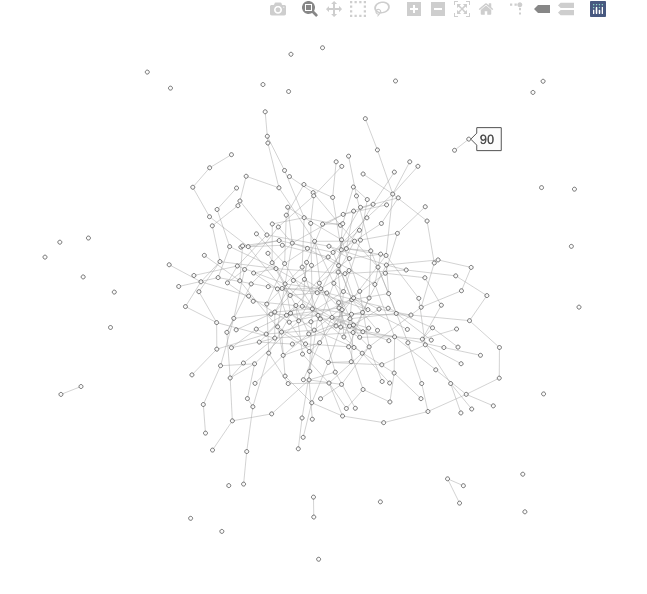
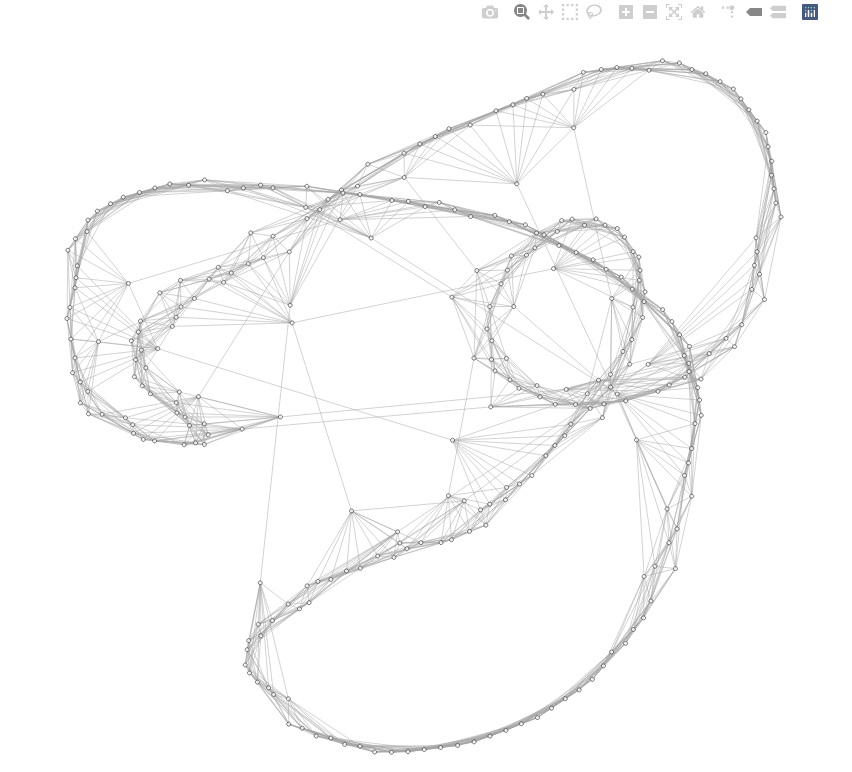
Visualizing Larger Graphs
Lastly, let’s visualize some random larger graphs. It would be a good idea to make the nodes smaller for better visibility.
G = nx.watts_strogatz_graph(300, 12, 0.01, seed=12345)
pos = nx.spring_layout(G)
vis = GraphVisualization(G, pos, node_size=4, node_border_width=1, edge_width=0.5)
fig = vis.create_figure(height=800, width=800, showlabel=False)
fig.show()
When you hover over a vertex, its name (vertex label by default) will show up.
G = nx.erdos_renyi_graph(300, 0.008, seed=12345)
pos = nx.spring_layout(G, iterations=20)
vis = GraphVisualization(G, pos, node_size=4, node_border_width=1, edge_width=0.5)
fig = vis.create_figure(height=600, width=600, showlabel=False)
fig.show()