 An isosurface extraction of the bone from the visible woman data set
(Parker and Shirley, data courtesy National Library of Medicine).
An isosurface extraction of the bone from the visible woman data set
(Parker and Shirley, data courtesy National Library of Medicine).
An isosurface extraction of the bone from the visible woman data set
(Parker and Shirley, data courtesy National Library of Medicine).
 An isosurface extraction of the skin from the visible woman data set
(Parker and Shirley, data courtesy National Library of Medicine).
An isosurface extraction of the skin from the visible woman data set
(Parker and Shirley, data courtesy National Library of Medicine).
 An maximum intensity projection rendering of the bone from the
visible woman data set (Parker and Shirley, data courtesy National
Library of Medicine).
An maximum intensity projection rendering of the bone from the
visible woman data set (Parker and Shirley, data courtesy National
Library of Medicine).
 This top-down view of the head shows the
cerebral arteries within the brain. The visualization was created by
a volume rendering technique that effectively allows us to view a
three-dimensional data set and highlight particularlyinteresting
parts of the volume. Here, we highlight the cerebral arteries in an
attempt to isolate a large aneurisym on the right side of the image
(Gordon Kindlmann and Peter-Pike Sloan).
This top-down view of the head shows the
cerebral arteries within the brain. The visualization was created by
a volume rendering technique that effectively allows us to view a
three-dimensional data set and highlight particularlyinteresting
parts of the volume. Here, we highlight the cerebral arteries in an
attempt to isolate a large aneurisym on the right side of the image
(Gordon Kindlmann and Peter-Pike Sloan).
 In this figure we have isolated the cerebral arteries by filtering out
the rest of the head and brain. The aneurisym, the ``peanut-shaped''
object on the right side of the image, is now highly visible. As a
side note, a series of such images were used to aid neurosurgeons at
the University of Utah Medical Center, in planning surgical
strategies (Gordon Kindlmann and Peter-Pike Sloan).
In this figure we have isolated the cerebral arteries by filtering out
the rest of the head and brain. The aneurisym, the ``peanut-shaped''
object on the right side of the image, is now highly visible. As a
side note, a series of such images were used to aid neurosurgeons at
the University of Utah Medical Center, in planning surgical
strategies (Gordon Kindlmann and Peter-Pike Sloan).
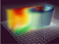 Volume rendering of simulated flow around a submarine fairwater (Nelson
Max, data courtesy of Mark Christon).
Volume rendering of simulated flow around a submarine fairwater (Nelson
Max, data courtesy of Mark Christon).
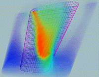 One hundred twenty three thousand convex polyhedra comprising a pyramidal
wing dataset (Nelson Max).
One hundred twenty three thousand convex polyhedra comprising a pyramidal
wing dataset (Nelson Max).
 This visualization illustrates a moment from a simulation
of epilepsy occuring within the temporal lobe of the brain. The
figure shows the electrical current densities throughout the
head/brain at one instant of time. Red indicates areas of high
electrical current while blue indicates regions of significantly less
electrical current. Such visualizations aid researchers in
localizing the source of an epileptic seizure (David Weinstein and
Chris Johnson).
This visualization illustrates a moment from a simulation
of epilepsy occuring within the temporal lobe of the brain. The
figure shows the electrical current densities throughout the
head/brain at one instant of time. Red indicates areas of high
electrical current while blue indicates regions of significantly less
electrical current. Such visualizations aid researchers in
localizing the source of an epileptic seizure (David Weinstein and
Chris Johnson).
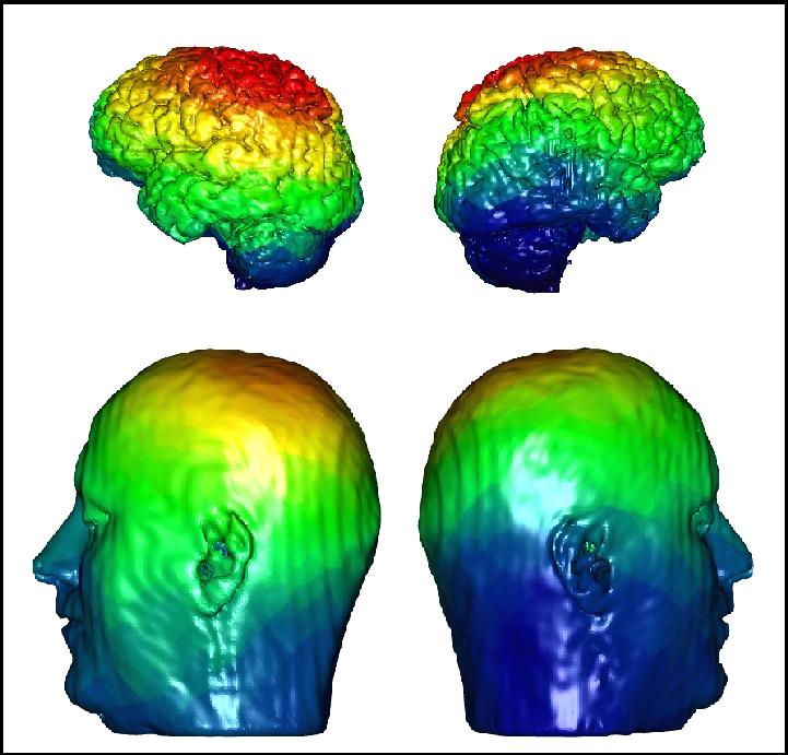 This figure depicts the visualization of electric voltage on
the surface of the brain (top) and surface of the scalp (bottom) from
a simulation in which the patient was given a sensory input (such as
the sight of a particular number or shape) meant to excite a
particular part of the brain. Here, red indicates positive voltage
and blue indicates negative voltage. The green areas indicate
voltages of approximately zero. The visualizations of the voltages
on the surface of the cortex (brain) were computed by an inverse
method that uses a set of high resolution EEGs and the geometry of a
specific patient's head and brain from MRI scans as input. Such
visualizations aid researchers in understanding fundamental aspects
of brain electrophysiology that can lead to a better understanding of
mental abnormalities and such thought processes as language use and
reasoning (David Weinstein).
This figure depicts the visualization of electric voltage on
the surface of the brain (top) and surface of the scalp (bottom) from
a simulation in which the patient was given a sensory input (such as
the sight of a particular number or shape) meant to excite a
particular part of the brain. Here, red indicates positive voltage
and blue indicates negative voltage. The green areas indicate
voltages of approximately zero. The visualizations of the voltages
on the surface of the cortex (brain) were computed by an inverse
method that uses a set of high resolution EEGs and the geometry of a
specific patient's head and brain from MRI scans as input. Such
visualizations aid researchers in understanding fundamental aspects
of brain electrophysiology that can lead to a better understanding of
mental abnormalities and such thought processes as language use and
reasoning (David Weinstein).
 This figure illustrates the voltage distribution of a body
surface potential map (BSPM) on the right. The torso on the left has
been opened to reveal electrical current paths within the torso
volume at one instant in time within a heart beat. Here again, red
indicates positive voltage, blue indicates negative voltage, and
green indicates voltages of approximately zero (Chris Johnson, Rob
MacLeod, and Mike Matheson).
This figure illustrates the voltage distribution of a body
surface potential map (BSPM) on the right. The torso on the left has
been opened to reveal electrical current paths within the torso
volume at one instant in time within a heart beat. Here again, red
indicates positive voltage, blue indicates negative voltage, and
green indicates voltages of approximately zero (Chris Johnson, Rob
MacLeod, and Mike Matheson).
 This is a graphical representation of the geometry and
electrical current flow in a model of the human thorax. The model
was created from MRI images taken of an actual patient. Shown are
segments of the body surface, the heart, and lungs. The colored
loops represent the flow of electric current through the thorax for a
single instant in time, computed from voltages recorded from the
surface of the heart during open chest surgery. This visualization
presented particular challenges because of the complexities of the
three-dimensional voltage loops (Chris Johnson, Rob MacLeod, and Mike
Matheson).
This is a graphical representation of the geometry and
electrical current flow in a model of the human thorax. The model
was created from MRI images taken of an actual patient. Shown are
segments of the body surface, the heart, and lungs. The colored
loops represent the flow of electric current through the thorax for a
single instant in time, computed from voltages recorded from the
surface of the heart during open chest surgery. This visualization
presented particular challenges because of the complexities of the
three-dimensional voltage loops (Chris Johnson, Rob MacLeod, and Mike
Matheson).